In just one month, were going to have a new twenty dollar bill. Here are pictures of the front and back. Theres a bit of green, a bit of blue, and a bit of what theyre calling peach. The same part of me is mildly excited about this as the one that finds the state quarters rather nifty, but more so our banknotes have been long, long overdue for a change. The semiotic value of having an easy association of green with cash is far outweighed by the points we lose for having super-boring currency.
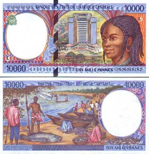
The new bill has a slightly-bigger picture of Jackson, which, as with Franklin and the $5, makes him look a little bit more like a movie star. Most of the changes are for anti-counterfeiting and not aesthetic reasons, though. It looks better, but were not going to win any international competitions. This is in keeping with the Rule of Currency Attractiveness, which states that the higher the GDP of a country, the less bold and interesting its banknote design. (Look how cool Gabons bills are.) European countries have often bucked that trend Dutch guilders get high marks but those are getting all gobbled up by Euros now. Best currency-portrait award goes to Australia, though. Is it me or do all those people look vaguely angry?